How to Choose a Small Apartment Color Palette
Build a small apartment color palette from one light base, a couple of neutrals and one or two accents, matched to your floor, your daylight and every room you can see at once.
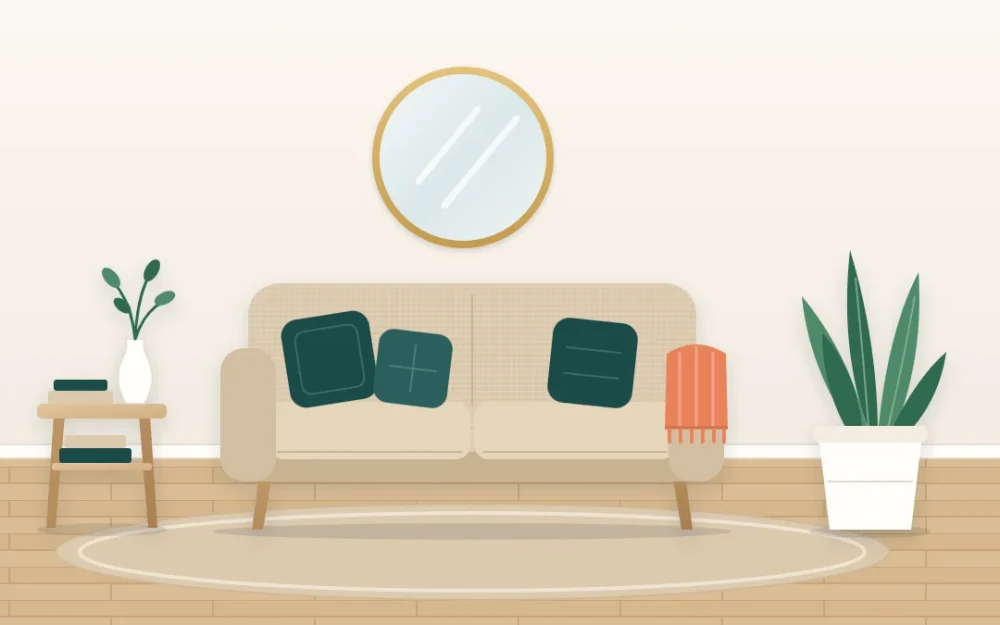
In a large house, each room can go its own way. In a compact home you can often see the sofa, the bed and the kitchen counter from one spot, so every color you own ends up in the same view. That is why a small apartment color palette matters more than any single paint or fabric choice.
A palette is simply a short list of colors you agree to stick to, with a rough idea of how much of each. It does not have to be pale or plain. It has to be limited, and it has to get along with the things already in the room.
Start with what you cannot change
Before choosing anything, look at the fixed elements: the floor, kitchen counters and cabinets, tiles, window frames, and any large furniture that is staying. These already hold a big share of the color in the room, so they are the first members of your palette whether you like them or not.
Lay a sheet of plain white paper on the floor and against the counter. Next to pure white, the surface will lean one way: yellowish, pinkish or orange (warm), or bluish, greenish or gray (cool). That lean is the undertone, and it is the thing your new colors need to agree with.
- Honey or reddish wood floors, cream tiles and beige carpet lean warm.
- Gray laminate, white counters with blue veining and chrome lean cool.
- If the fixed elements disagree with each other, let the largest one, usually the floor, decide.
Build the palette in three layers
A workable palette has three kinds of color, each with a different job. A base keeps the room light, supporting neutrals give it body, and accents give it character.
| Layer | How many | Where it goes | Examples |
|---|---|---|---|
| Light base | One | Walls, curtains, large bedding, the biggest surfaces | Warm white, soft cream, pale greige |
| Supporting neutrals | One or two | Sofa, rug, wood furniture, baskets | Sand, oatmeal, oak, charcoal |
| Accents | One or two | Cushions, a throw, art, a vase, one chair | Pine green, apricot, dusty blue, ochre |
Choose the accents last. If you are unsure which two go together, pick neighbors on the color wheel for a gentle pairing, such as green with blue-green, or opposites for a livelier one, such as green with a soft orange.
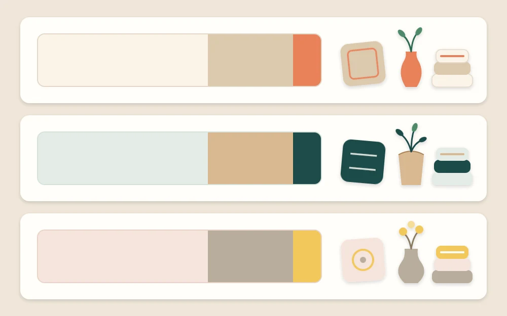
Use 60-30-10 as a loose guide
The 60-30-10 proportion is a handy way to picture how much of each layer to use: roughly 60 parts base, 30 parts supporting neutral and 10 parts accent. Treat it as a starting point, not a law. Nobody measures a room this way, and a rental with white walls and pale floors may already be well past 60 on the base before you bring in a single thing.
What the guide really teaches is the order of size. The lightest color should cover the most area, and the strongest color the least. When a room feels loud, the accent has usually grown too big. When it feels flat, the accent is missing or appears only once.
Tip
Squint at the room from the doorway. The details blur and you see only blocks of color, which makes it easy to judge whether the balance is mostly light, partly neutral and lightly accented.
Check your colors in your own daylight
The same cream can look buttery in one apartment and dull in another, because daylight has a color of its own that shifts with direction and time of day.
- North-facing rooms get cooler, steadier light. Warm bases and warm accents keep them from feeling chilly; cool grays can turn flat.
- South-facing rooms get strong, warm light for much of the day. Most colors look good here, and cooler tones can balance the glow.
- East-facing rooms are bright and warm in the morning, cooler later on.
- West-facing rooms are cooler in the morning and turn golden in the evening.
Bring samples home before you commit. Prop a cushion cover, a fabric swatch or a paint card where it will live and look at it in the morning, at midday and under lamp light in the evening.
Carry the palette from room to room
A small home reads as one space, so use one palette for all of it and vary the proportions instead of the colors. The living area might be mostly sand with touches of pine green, the bedroom mostly warm white with a quieter green and a little apricot, and the bathroom white with a single green towel.
Let at least one accent appear in every room, even as something small. Standing at the front door, you should be able to spot the same color two or three times along the view. If you are still at the stage of deciding what goes where, the beginner’s order for decorating a small apartment shows where the palette fits among the other steps.
Add color when the walls must stay white
White walls are a ready-made base, not a limit. Everything else in the palette can arrive on things you own and can move.
- Textiles first: the rug, curtains, cushion covers, a throw and bedding hold more color than any wall in a small room.
- Art second: one large piece containing both of your accents ties the scheme together. The roundup of wall decor ideas for blank walls has options at several scales.
- Furniture and objects: a painted side table, a colored lampshade, ceramic vases, book spines and plant pots.
Because these pieces are easy to change, they are also the place to play. Keep the base and neutrals steady all year and let a cushion cover or a vase of stems shift with the months, as described in the seasonal swap system for a small apartment.
Signs the palette needs editing
Run through these quick checks once the room is together.
- You can count more than five or six distinct colors from one spot. Remove or regroup the strays.
- An accent appears only once. Repeat it twice more or let it go.
- Something looks dingy. Its undertone probably disagrees with the floor or the base; swap it for a warmer or cooler version of the same color.
- The room feels bland. Deepen one neutral, such as a darker wood or a charcoal cushion, before adding a new color.
Frequently asked questions
What colors work best in a small apartment?
There is no single best set. Light bases help a compact room feel open, but the better test is whether your colors agree with the floor, counters and daylight you already have. A limited list repeated through every room usually looks calmer than any particular shade chosen on its own.
Can I use dark colors in a small apartment?
Yes, in measured amounts. A deep green, navy or charcoal works well as an accent or as one supporting neutral, such as a sofa or a large artwork. Keep the biggest surfaces light, repeat the dark tone a few times around the room, and add lamp light nearby so it reads as rich instead of heavy.
Should every room in a small apartment be the same color?
The rooms should share a palette without being identical. Keep the same base, neutrals and accents throughout, then shift the balance: more accent in the living area, less in the bedroom. That way each room has its own mood while the view from one to the next still feels connected.